Are you tired of blindly running native ads and hoping that they resonate with your target audience? Well then, it's time to take action and split-test your ads!
Oh, split-testing. If only it were as straightforward as splitting a Kit-Kat bar. But alas, it can be a bit confusing. Especially when it comes to your native ad campaign.
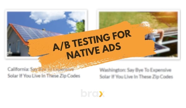
Where do you start? What do you test? Are there any cheat codes we should know? Fear not, my fellow marketer. We're here to make split-testing a piece of cake (or Kit-Kat, if you will).
In this article, we'll talk about what is A/B testing (also known as split testing or bucket testing), and guide you through the steps of AB testing for native ads.
It's super useful for figuring out what works best with your native ads. By the time we're done, you'll be a pro at knowing what clicks with your audience and how to rake in those sweet leads or sales.
Oh, and if you're using Brax (which, c'mon, you totally should be if you're into native ads), we're gonna teach you how to rock A/B testing on our platform as well. Don't sweat it – you don't need to be an expert. Just hang with us and we'll show you the ropes.
What is A/B Testing?
If you're tired of guessing what digital ads connect with your target audience then A/B testing is the solution.
This powerful tactic has long been employed in advertising processes to create, refine, and ultimately identify the best digital ads that truly resonate with their intended audience.
Advertising companies have long been testing how ads resonate with audiences by showing them to a test group for decades. It's part of market research.
But in the digital age, we don't have to do that. Plus, if you're a small business owner, this technique for market research might just be too expensive, right? So what's a savvy marketer to do?
Well, fear not my fellow ad guru, we can still evaluate how ads work by actually showing them to audiences and then analyzing how they engage. It's like throwing cooked pasta at a wall and seeing what sticks to make sure it's perfect. Except in this case, the pasta is your ad and the wall is your audience.

It's called A/B Testing because you launch at least two ad options: A and B. Then, based on the data, you evaluate which performs better.
With A/B testing, you can narrow down your options to find the most engaging visuals, messaging, targeting, and even offer structures.
You don't have to stick with just two variations, though.
Particularly if you're using native ads, you can create dozens of ads within the same campaign! However, to avoid gathering too little data per variation or too similar results, it would be best to work with a low number at the beginning. Anywhere between 5 to 10 native ads is good, as a start.
Steps to Follow When Split-Testing
Ready to become a testing master? Here's a step-by-step guide to help you out:
1. Select an element to test
Start by picking an element you want to test. This can be anything from the headline, images, call-to-action buttons, targeting selection, and more (we'll talk about your options in a while). It can't be everything all at once else you won't know what part of what you're testing really delivered the result you want!
Let's go for headlines as an example. For instance, the text in ad A is all in lower case, while the text in ad B is in upper case (this is just an example though, don't make your native ads text in upper case!)
Or maybe ad A uses an image of a basket of oranges, while ad B uses an image of a single orange, while still targeting the exact same audience for both.
This way, if ad A performs better than B, then you know the reason why.
2. Create variations
Let's say you chose to split-test the headlines. Get those creative juices flowing and come up with at least two different headlines for your ad.
Think of it as casting a wide net – the more options, the better your chances of catching the perfect fish. 🐟

3. Set up your split test
Choose an ad platform that supports A/B testing. Almost all native ad platforms support having at least two creatives per campaign or having at least two ad groups or ad sets per campaign.
Create two separate ad sets, each with one of your variations.
4. Keep everything else the same
To make sure we're only testing the headlines, keep all other elements of the ad identical.
Imagine it's like conducting marketing experiments – you want to isolate the variable you're testing and avoid any wildcards muddying the waters.
5. Choose your success metric
Before you set your test in motion, figure out what you want to keep an eye on (a.k.a. your goal).
Are you chasing more clicks, souped-up conversion rates, a stellar ROI, or higher revenue? Choose a metric that grooves with your campaign goals and let it be the North Star guiding your way.
6. Set a time frame
Give your test some time to run – you don't want to jump the gun and call a winner too early. Of course, it depends on your budget and traffic.
You might want to let the test run for at least a week or two. This part is like baking a cake – you need just the right amount of time for it to rise to perfection. 🎂

7. Analyze the results
Crunch time! Alright, so your test has done its thing, and now it's time to dive into those digits and see which headline strikes gold.
Put on your comparison cap and check out the performance metrics of each ad set, then declare a winner based on your chosen measure of success.
8. Optimize and iterate
Now that you've found your winning headline, don't rest on your laurels! Keep testing new headlines and optimizing your ads to keep your audience hooked and improve your campaigns over time.
What Parts of the Advertising Campaign Should You Test?
Every business has unique advertising needs that require a customized approach. That’s why testing is crucial to ensure the effectiveness of your advertising campaign.
However, there's no universal formula for A/B testing for native ads. So, let me walk you through various parts of a campaign you can test and what goals are related to experimenting with these parts.
Whether it’s testing the headlines, body copy, images, or call-to-action, each element plays a significant role in attracting and converting your target audience.
By knowing what parts of your advertising campaign to test, you’ll be on your way to maximizing its impact and generating the results you desire.
Author's Note: This is not an exhaustive list. In reality, there's a vast world of marketing elements to explore, and we can't possibly cover them all in one blog post! So let's outline just the most common ones or those that I believe have the biggest impact on ad results.
Ad Creatives
Ah, ad creatives — the make or break of any Native Ad campaign. But what exactly are they? Well, my friend, ad creatives are essentially the visual and textual elements of your ads — the eye-catching images and clever headlines designed to lure in potential customers.

They're like the Tinder profile of your ads — they need to be swipe-right-able in order to get the results you're looking for.
And let's be real, nobody wants to be left swiping through pages of poorly designed, unappealing ads. That's why split-testing your ad creatives is crucial.
The goal is simple — to create eye-catching, attention-grabbing, can't-look-away ads that encourage your customers to make that click. The purpose here is to increase engagement. In native advertising terms — getting more clicks or increasing click-through rates (rate of clicks against ad impressions).
Here are the parts of Ad Creatives that you can split test (for native ads):
Headline
Now, we all know that a headline can make or break an ad campaign. It's like the pick-up line that either gets you a date or leaves you hanging. So, it's crucial to test different headlines to find the one that makes your audience swoon.
Images
A picture is worth a thousand words, and in the realm of native ads, it's the visual bait that reels in your audience. Try using images of your brand, tested against images of people using what you are promoting, and tested still against images without people in it.
If you have a limited set of images at hand, check out these image sources for free and paid options that you can use for your ads.

Call to Action
You might be thinking, "What's the big deal about CTAs? Just slap on a 'Buy Now' button and call it a day!" Well, hold your horses, my friend! CTAs are the wizards behind the curtain, guiding users toward taking the desired action.
For example, one version might say "Learn More" while the other says "Discover the Secret." You might find that CTRs differ widely here!
Not all native ad platforms have extra space for CTAs, but even without the extra field for CTAs, you still use them in headlines, right? It helps push the audience in the right direction, after all.
Dynamic Ads vs Static Ads
Dynamic ads are like the chameleons of the advertising world, adapting their form based on factors like location, device, and more. All you need to do to make this work is use dynamic keyword insertion in the headline of your native ad and the platform will automatically populate the right word.
Static ads, on the other hand, are like your favorite childhood toy that never changes, no matter how much you play with it. These ads stick to the same message and visuals for every user, not caring about preferences or context.
They may lack the fancy tricks of dynamic ads, but sometimes, simplicity hits the sweet spot in getting a message across.
Landing Pages
Even the most meticulously crafted landing page can benefit from a little experimentation. That's where split-testing swoops in like a superhero, armed with data-driven insights to help you optimize your landing pages for peak performance.
The goal with AB testing landing pages is to maximize conversions — may it be to capture that lead, prompt the user to visit the next page of the funnel, or even proceed to purchase (thereby improving ad revenue).
By testing multiple variations of your landing page, you're essentially placing bets on different horses in the race for conversion success. And who doesn't love a good horse race?
So what do you test with a landing page? Here are some items you can add to your checklist:
Content
The copy on your landing page is like a siren's song, luring visitors towards your desired action – be it signing up for a newsletter, downloading an eBook, or making a purchase.
Crafting the perfect copy requires striking the right balance between informative, persuasive, and engaging while maintaining a consistent tone and messaging that resonates with your target audience.
There are various ways to test here!
You can try business style versus story style versus news theme.
You can split-test between long-form and short-form content.
You can even try text versus video content!
Images
The media within the landing page must also be tested, similar to how the images in the ads can have variations.
One thing we highly recommend is having the ad's image match that of the ones on the landing page. If there are multiple images on the landing page, you can use one of them for the ad.
This is for uniformity and consistency — so that the user will not think he arrived at a different page.
Call to Action
While the goal of the CTA in an ad is to encourage a click, the CTA on your landing page should encourage a conversion.
The CTA is the linchpin of your landing page – the decisive moment where visitors make the choice to engage with your brand or continue on their merry way.
Crafting the perfect CTA requires a delicate balance of enticing language, eye-catching design, and strategic placement to create a persuasive and irresistible invitation for your audience.
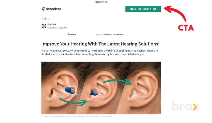
Split-testing your landing page CTA is like hosting a grand tournament, pitting various contenders against one another to determine which champion will reign supreme in driving conversions. Here are some key aspects of your CTA to consider testing:
-
Copy
The text of your CTA should be clear, concise, and persuasive. Experiment with different phrases, action verbs, and lengths to discover which combination of words motivates your visitors to click and convert.
-
Design
The visual appearance of your CTA plays a crucial role in capturing attention and enticing clicks. Test different colors, shapes, sizes, and fonts to identify the most appealing and effective design that complements your overall landing page aesthetic.
-
Placement
Finding the optimal location for your CTA can make a huge difference in its visibility and effectiveness. Test various placements, such as above the fold, below the fold, or even as a floating button, to determine which position garners the most engagement from your visitors.
Overall Style
The overall style of your landing page is like the enchanting ambiance of a grand ballroom, setting the stage for an unforgettable experience that leaves guests craving more.
A harmonious blend of visual elements, compelling copy, and intuitive navigation creates a delightful user experience that encourages visitors to engage with your brand and ultimately convert. You'll be surprised at how much a simple font style or background color can influence a buyer's decision!
Here are some key aspects of your landing page style to consider testing:
-
Color scheme
The colors you choose can greatly impact the mood and perception of your landing page. Test different color combinations and contrasts to find the most visually appealing and effective palette.
-
Typography
The fonts you select can influence readability and overall aesthetics. Experiment with various font styles, sizes, and spacing to identify the most legible and visually pleasing typography that complements your design.
-
Layout
The arrangement of elements on your landing page can affect user flow and engagement. Test different layouts, such as single-column, multi-column, or asymmetrical designs, to determine which configuration best showcases your content and drives conversions.
Testing Target Audience
Now while ad copy and landing pages are the most commonly tested parts of an advertising campaign, there are other elements that you should not forget to experiment with.
However, we do recommend trying these when you've already narrowed down to your best ad creatives and landing pages.
Targeting by Location
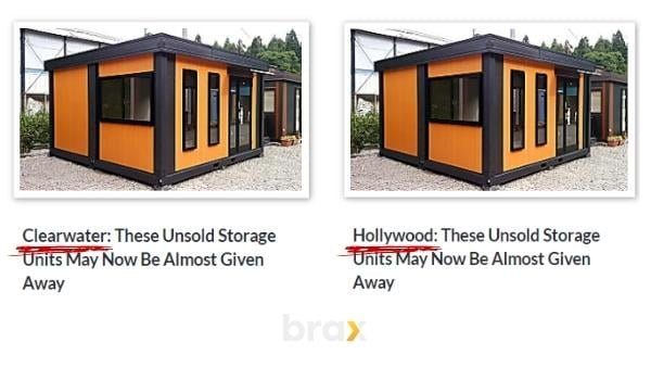
Let's say you are looking for audiences in California. Instead of targeting the entire state of California, why not narrow it down to specific cities like Los Angeles or San Francisco?
Interest-Based Targeting
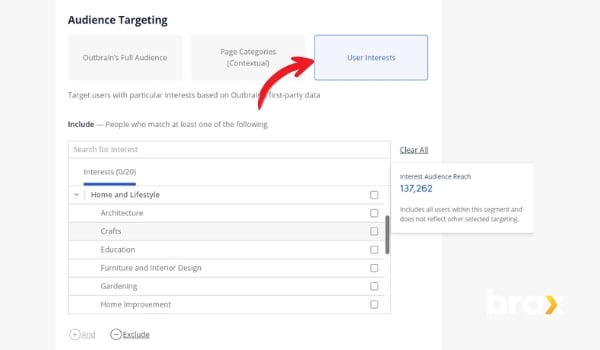
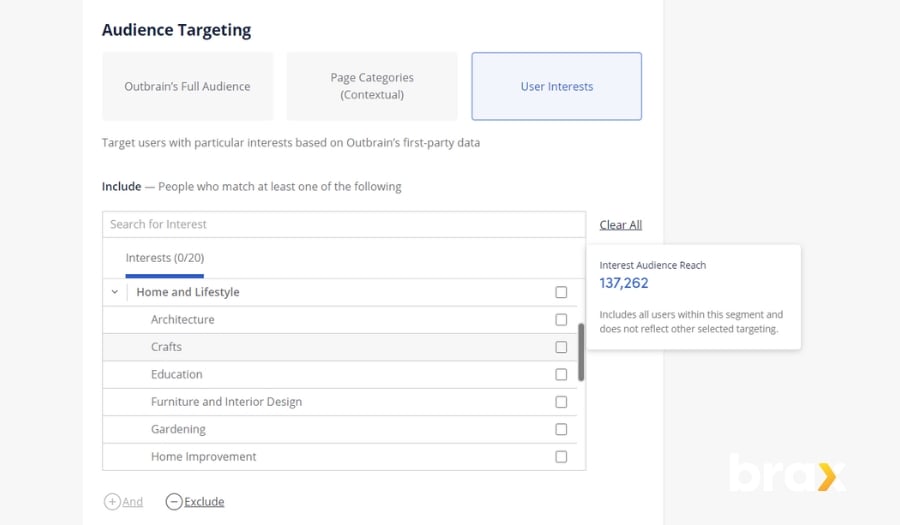
Interest-based targeting for native ads is the secret sauce for connecting with users who are genuinely intrigued by your content. By honing in on specific interests, marketers can craft native ads that effortlessly blend with the platform's environment and resonate with a highly relevant audience.
This can be done with native ads platforms like Outbrain which already has information on their users' interests. Interest-based targeting is most commonly found in social media platforms, though.
Contextual Targeting
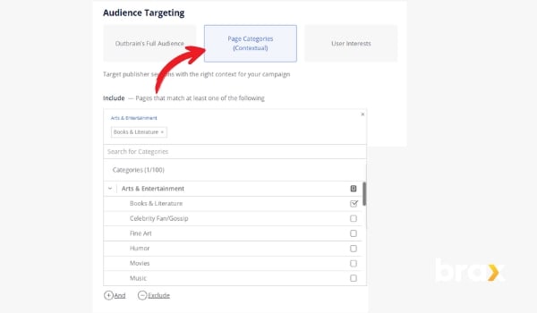
While interest is based on the user's previous behavior, contextual targeting is based on the content of the website the user is currently viewing. This can also be called category targeting since most advertising platforms actively categorize publishing websites based on their content.
ISP or Carrier Targeting
There are times when users of a specific ISP or mobile carrier respond better to ads. It could be due to connection speeds or maybe even because users of certain providers follow a certain behavioral pattern.
Whatever the reason may be, this targeting filter should not be overlooked.
Device Brands and Price Range
Focusing on device brand targeting in online advertising is a smart move that involves customizing ads based on the user's device brand, such as Apple, Samsung, or Google.
This approach significantly impacts user engagement by allowing advertisers to craft more tailored and pertinent content that aligns with each device brand's distinct features and user preferences. As such, this tactic is best used when partnered with dynamic ads that mention the user's brand.
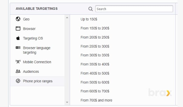
And believe it or not, some ad networks even have the "phone price range" targeting, with the assumption that those who buy higher-priced devices react differently to ads than those who buy low-end phones.
Platform or Device Type
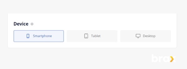
Platform testing for digital ads is an astute strategy that involves tailoring ad campaigns to users based on the device being used, such as desktop, tablet, or mobile.
This approach significantly influences user engagement by allowing advertisers to create more customized and relevant content that aligns with the specific browsing habits, screen sizes, and functionalities of each platform.
It follows the theory that different people tend to respond differently to ads whenever using various platforms.
For instance, Baby Boomers are said to trust desktops more than mobiles when it comes to anything related to finance. Gen Zs, on the other hand, prefer mobile transactions to desktop transactions due to convenience.
Connection (WIFI vs mobile data or carrier)
Last but not least is connection targeting. By adopting connection targeting, marketers can elevate user engagement with ads designed specifically for each type of internet connection.
For example, WiFi users typically enjoy faster speeds, so ads could feature rich visuals and immersive interactive elements. On the other hand, mobile carrier users might appreciate ads with streamlined content and quick-loading components, mindful of varying data plans and connection speeds.
Diving deeper into users' browsing habits and preferences, connection targeting helps marketers craft messages that are not only relevant but also mindful of the audience's connectivity context. This attention to detail paves the way for higher engagement and conversion rates.
Takeaways from Part 1
We've delved into the importance of AB testing, how to apply them to your native ad campaigns, and what elements of an advertising campaign you can split test.
Equipped with this knowledge, you're now ready to take your ad campaigns to new heights.
Stay tuned for Part 2, where we'll discuss how to set up A/B testing using Brax to optimize your native ads further. Keep an eye out for our upcoming article, and get ready to revolutionize your marketing strategy!
Oh and if you haven't done so yet, book a free demo of Brax to maximize your native advertising! You won't regret it.
