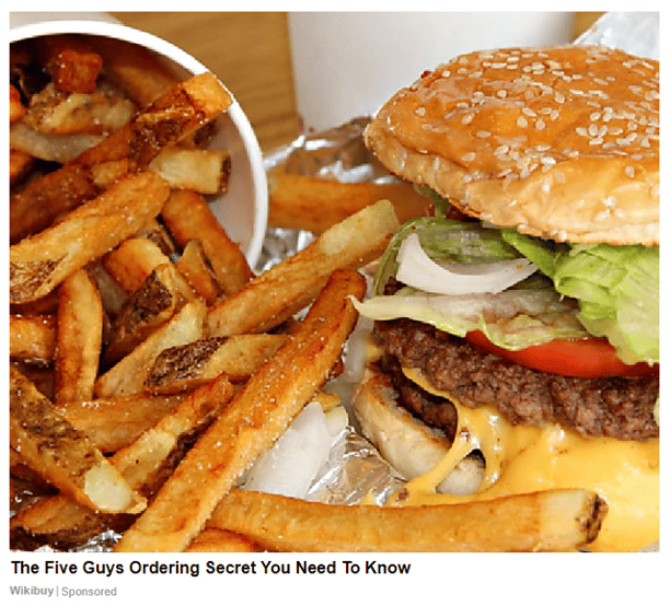
Powerful, eye-catching ad images can give native ads compelling appeal, maximizing click-throughs to boost your campaign’s effectiveness.
FYI, many of us have extreme banner blindness, and will miss the examples below thinking they are actual ads - they are just screen shots, Brax never includes ads on our blog. 😀
Native ads don’t have long to make an impact—and the use of powerful or dynamic ad images can capture your reader’s attention, stopping them in their tracks.
It’s been over a hundred years since the phrase, “A picture is worth a thousand words” crept into the English language, and the sentiment is truer than ever.
The internet has transformed the act of reading from something passive and text-driven to a more visual artform powered by multimedia. And while text still has the power to entertain and inform, a well-chosen photo can linger in the memory far more effectively than text can.
More importantly for native ad campaigns, the right image can also increase CTRs, giving a welcome boost to audience engagement. Irresistible native ads are almost always accompanied by dynamic ad images that draw us in by tapping into our sense of beauty and intrigue.
What makes a great ad image?
Eye-tracking research by Poynter has proved audiences tend to look at dynamic images when confronted with a large amount of on-screen information. They may well look at a native advert’s image before its headline, so linking the two is crucial. The image should have some connection to the headline, though it’s fine to convey a sense of mystery in your choice of photo.
Below, we discuss some of the key elements found in the most compelling and powerful ad images. These aspects can all help to capture your audience’s attention, pique their interest, and make your native ads impossible to ignore.
Faces
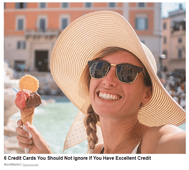
A photo of an attractive person carries a lot of appeal. If that person is reflecting a positive emotion by grinning at the camera, or appears to have a secret (looking downwards with a coy smile), their draw is even greater.
When you’re working with human subjects, Taboola recommends medium zoom cropping to focus on their facial expressions, rather than their pose or clothing. It’s also important that models are relatable to your audience, to show your business understands its target demographics.
Color
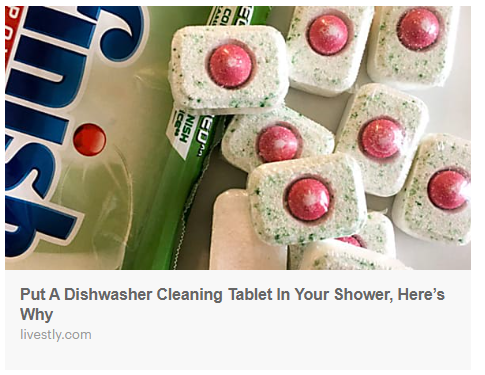
Colors carry all sorts of subconscious associations—red for danger and passion, green for nature and environmentalism, and so forth. This guide explains the psychology behind eight common colors. Not only do colors have different effects on our perceptions, but overlaid text is more readable on some colors than others. It might not be possible to use ad images that match your logo, but it’s a good idea to use similar shades to help boost brand recognition.
Intrigue
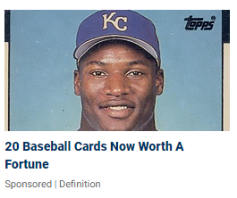
Earlier, we described how a model’s pose and facial expression can suggest knowledge. Because native ads are relying on a headline and an image to drive clicks, it’s helpful if images convey a sense of intrigue. In this example, you click because you want to know if you have any of these old cards in a draw that could be worth a fortune. Ideally, a native ad image should imply that it has the answer to a question.
Cropping
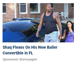
Building on the last point, many successful native campaigns have relied on curiosity-inducing ad images, such as publishing a small part of a larger picture with the promise that all will be revealed if the reader clicks through. The intent is to pique interest by telling part of a story in a native ad, even if the close-up isn’t fully representative of the wider image. This works well in native, where displayed image sizes can be as little as 150x150 pixels. (Here you want to see the rest of the car, and the girlfriend...)
Simplicity
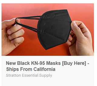
This one also expands on the previous point. People scrolling through a timeline or news site will see your ad for a second, so any image needs to be instantly clear. This is no place for optical illusions or photos with competing foreground and background elements. Look for images with one center of focus and a strong color contrast between this focal point and the backdrop. Bokeh blurring is ideal, as are repetitive backgrounds like a sky or parking lot. In this example, you have the harsh red vs black colors that really make the product stand out.
Picture perfect?
To be truly effective, a native ad campaign needs multiple creatives to determine which one best engages your audience. A photo of ducks walking across pebbles may ultimately prove more effective than a young, flirtatious-looking woman standing outside a yellow building, but you won’t know for sure without doing some A/B testing. Results may vary on different devices, or according to how large the image is displaying—even full-size images on Taboola are only 600x500 pixels.
You can develop and manage multiple native ad campaigns right here through Brax. If you haven’t already joined the ranks of companies managing their native ad images through our platform, why not sign up for our 15-day free trial?
