Picture this: you've invested countless hours, energy, and resources in creating the perfect native ad — and it's finally paying off! Your audience is loving your ad, clicking on it with wild abandon, and you're seeing a huge uptick in leads and purchases.
But what comes next? Where do you send these newfound potential leads?
It's not enough to simply push them to your website's homepage. No, no, no, my friend — where you direct your audience after they interact with your native ad is crucial to continue building that momentum and converting them into loyal customers.
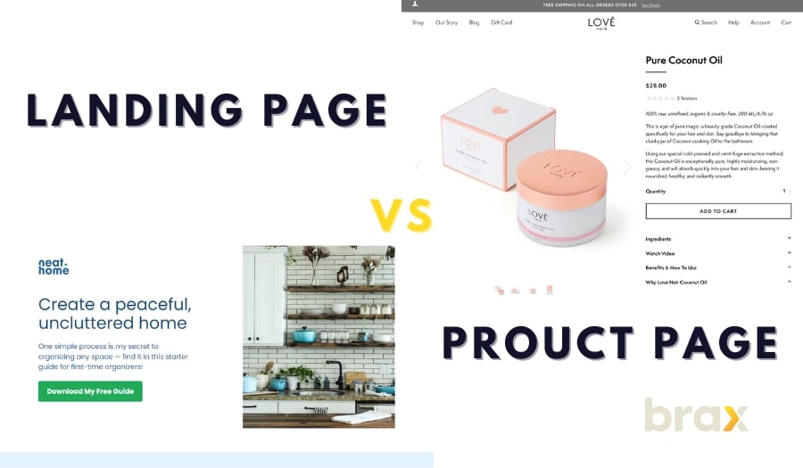
While you have many options, the two main ones to choose from are the landing page and the product page. But in a landing page vs product page comparison, which is better?
We'll help you with that. But first, let us discuss these two choices, what they are really, and then talk about the different scenarios where one is the better choice over the other.
Landing Page vs Product Page: What is the Difference?
Before we proceed, you must first understand what exactly these two pages are and how they are different from each other. This will give you a better idea of the difference in their roles.
What is a Landing Page?
As a marketer or business owner, you know the importance of grabbing your audience's attention from the get-go. As such, you might have heard the term “landing page” thrown around in digital marketing circles. But what is it exactly?
Simply put, it's where your audience lands after clicking on a link in an ad. Think of it as a VIP room specifically created for a marketing campaign.
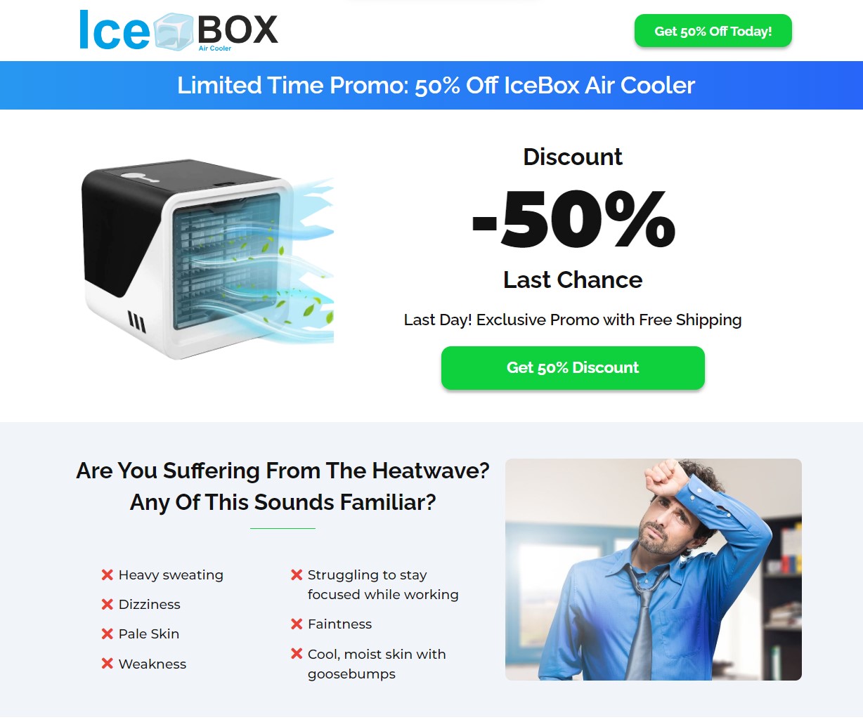
But don’t expect any champagne or fancy hors d'oeuvres, because a landing page is all business. These standalone web pages are designed with a single focus: to drive users toward a specific action. No distractions or meandering content — just a clear call to action.
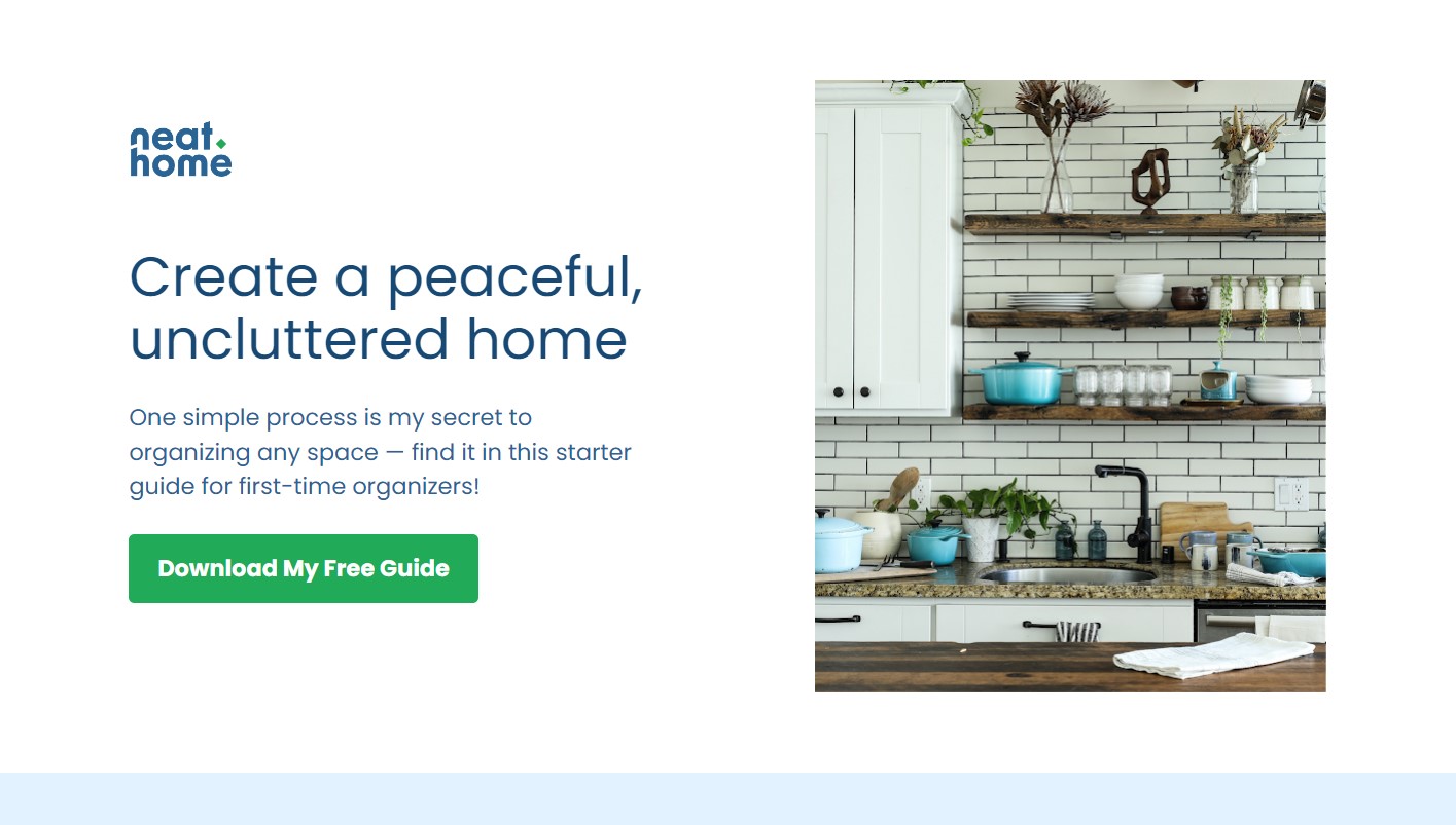
Often, you won't even find links to anywhere! Except maybe to Terms and Conditions and the Privacy Policy.
The Menu? Gone.
Link to homepage? Nowhere.
If the user would like to leave, the only option is to exit by closing the window or clicking the Call to Action link or button.
It's not that you're not giving them any other choice; it's that when faced with just two options, it's easier to filter possible customers from mere "passersby."
You can even use this page to connect with your audience with a touch of humor. Let’s be real; sometimes, it takes a few cringe-worthy Dad jokes to really seal the deal. Just don’t go overboard, folks.
Whether it's signing up for a newsletter, downloading an e-book, or purchasing a product, landing pages are your secret weapon to converting leads into paying customers.
There are a hundred different types of landing pages, but when it comes to promoting services and products, we recommend using benefit-focused landing pages, pain-focused landing pages, or story-type landing pages.
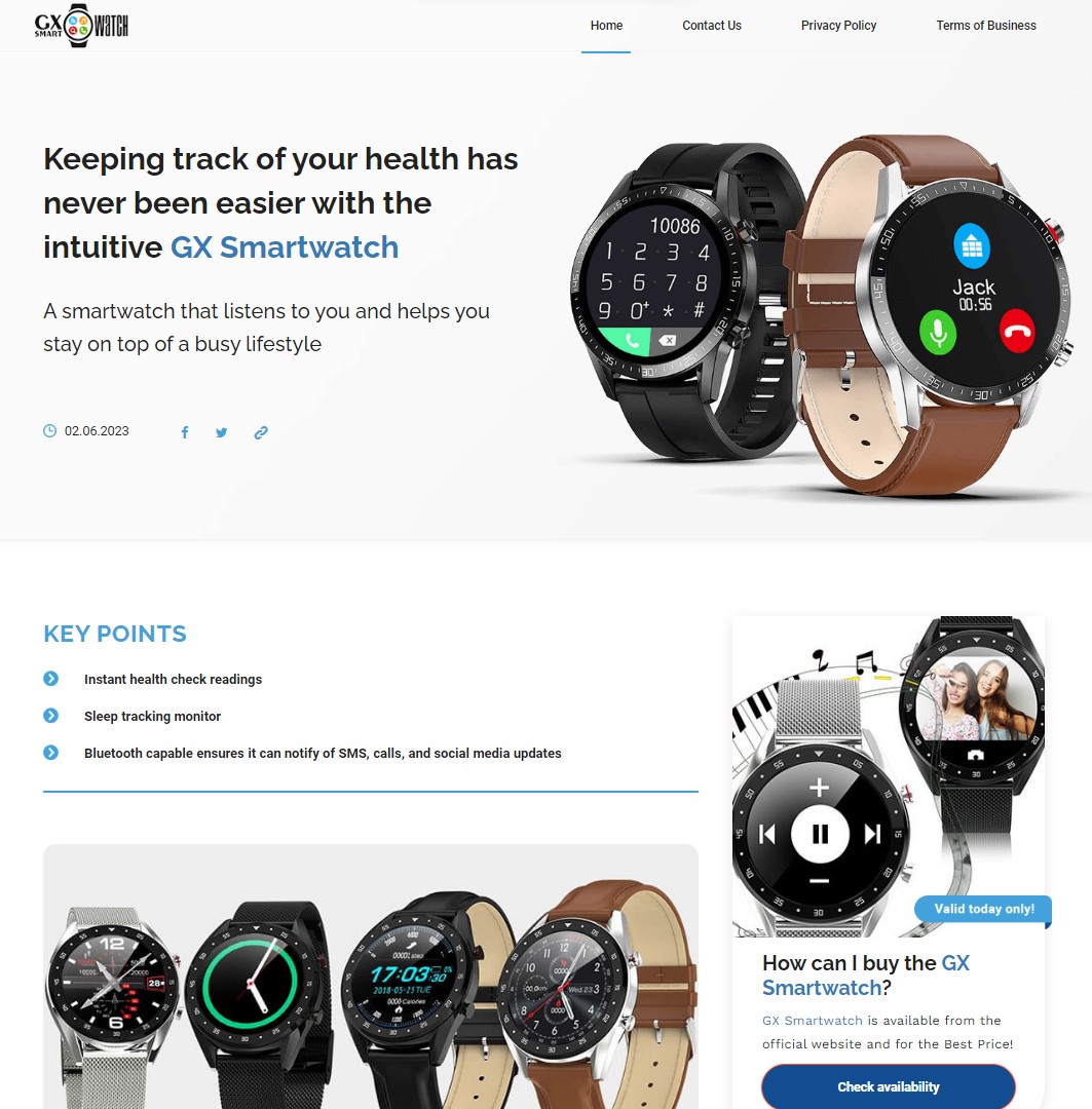
Benefit-Focused Landing Pages
One way to ensure that your message is clear and concise is by utilizing a benefit-focused landing page. This type of landing page clearly outlines the benefits that your product or service can bring to someone's life.
By focusing on the outcomes or results that your customers can expect, you'll be able to quickly grab their attention and let them know how your product can make a difference.
Think about the value your product gives instead of focusing on the product itself (which is what a product page would do). Remember that when faced with presenting the benefits versus features, the benefits should be your go-to choice.
Pain-Focused Landing Pages
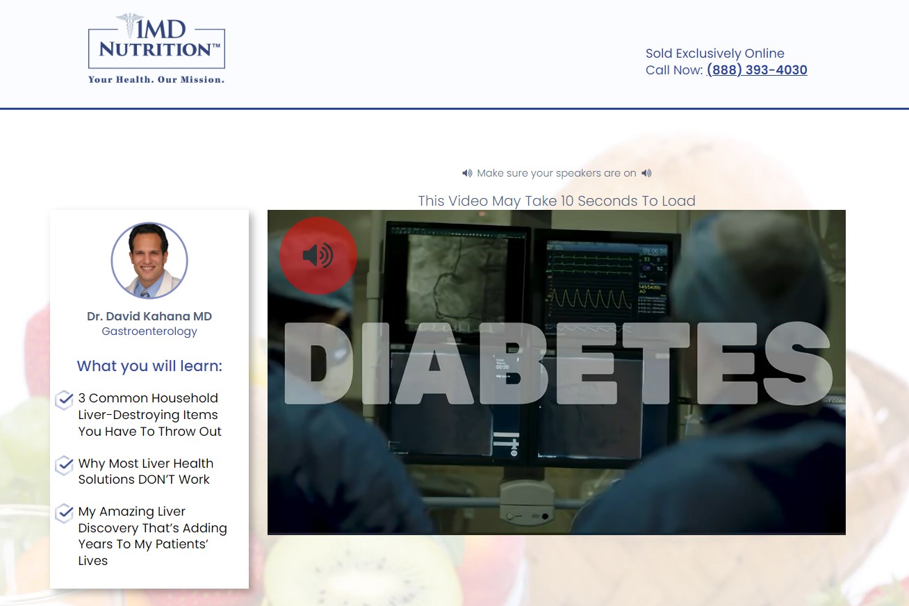
It's important for marketers to understand their customer's pain points and how they affect their decision-making process. That's where Pain-Focused Landing Pages come in.
By tailoring your content toward the specific struggles your customers are having, you can create a connection that piques their interest and encourages them to take action.
You can not only capture their attention but also guide them toward the solutions they seek. It's all about identifying those pesky problems and offering the perfect remedy.
Maybe they're tired of searching for a reliable dry cleaning service or struggling to find a health insurance plan that fits their needs. Whatever the case may be, a Pain-Focused Landing Page is your chance to not only address those concerns but also make a lasting impression on your readers.
Story-Type Landing Pages
It's crucial to capture your audience's attention and emotions, and that's where this type of landing page comes into play. Rather than presenting a boring list of features or dry news-style pieces, storytelling adds an element of humanity to your product or service.
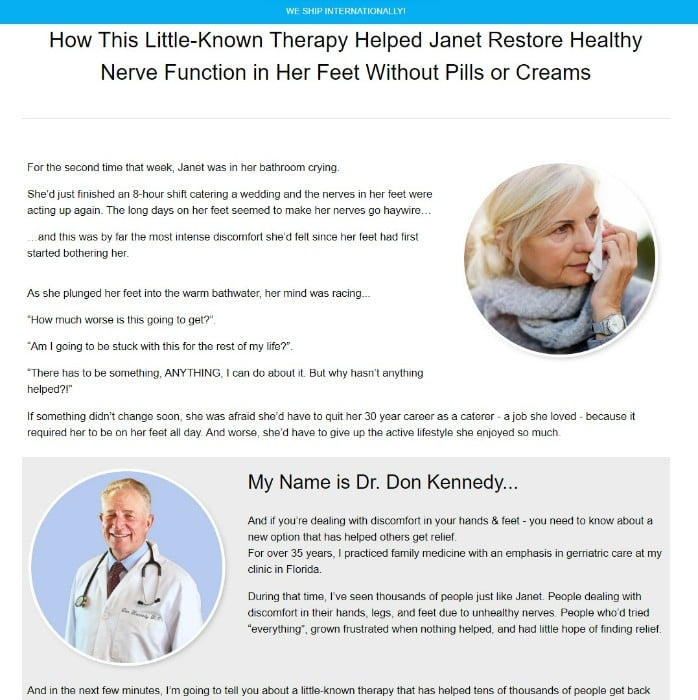
Regardless of your industry, it's important to engage your audience with a story that they can see themselves in. That means using relatable characters, exciting plot twists, and most importantly, a problem that needs solving.
But Story-Type Landing Pages go beyond just describing what your product does. They take readers on a journey that leaves them with a clear vision of how your product can help them overcome their obstacles.
By painting a picture of a real person struggling with a particular issue, you create a relatable character that readers can root for. Then, you introduce your company's solution as the hero of the story that comes in and saves the day, leaving your reader compelled and excited to learn more or even buy.
And when it comes to the content of the landing page, you also have the choice of whether to choose long-form or short-form content. As usual, the choice depends on the purpose of the landing pages.
What is a Product Page?
As a business owner, you already know that product pages are like the storefront of your e-commerce store. It’s the most important touchpoint your customers have with your product and your brand.
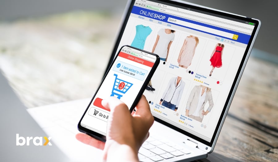
A product page is like a digital sales floor — only instead of mannequins and racks of clothes, it’s filled with detailed descriptions, killer images, pricing, and more.
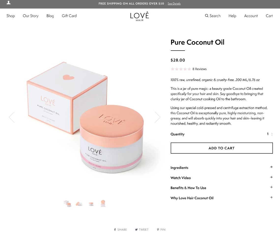
It should be like a friendly, knowledgeable salesperson, answering every possible question your customers might have. Its purpose is to make your customers feel confident and informed enough to hit that add-to-cart button.
From visually appealing images, product specs, features, and sizing charts to customer reviews and FAQs — the product category page should contain everything about the product.
After all, we know that online shopping can be a bit nerve-wracking. Without proper information, no one would be encouraged enough to proceed with a purchase. That's what the product page is trying to fill.
Where Should I Send My Customers To: Landing Page vs Product Page
Now as you can see from the descriptions, these two types of pages serve different purposes. While you can send your customers to any of these after clicking a native ad, it's important to know the best option for every scenario.
Understanding which is the right one based on your goals, your ad campaign, and your audience can increase the conversion rate and, ultimately, your ROI.
Let's discuss the possible scenarios one by one.
Scenario #1: When the Audience Has Never Heard of Your Product Before
Think of this scenario like waiting patiently for your friend to arrive at the restaurant. Suddenly you receive a text from them saying they've decided to bring another friend along for you to meet. You feel a little nervous, but at the same time, you're excited to meet someone new.
Well, that's sort of what happens when you introduce your product to an audience that's never heard of it before. It's a little nerve-wracking, but you can't help but feel hopeful.
So, what do you do? Would you send them straight to the page of a product they know nothing about? No, no, my friend. That's not how we roll here. Your audience will simply click on the back button or exit button quicker than you can say, "hey!"
That's why it's essential to send your audience to landing pages first instead of directly to your product page. Landing pages give them a chance to connect with your brand emotionally. Give them a chance to warm up to you, so to speak.
It's like meeting a friend's friend and learning about their hobbies and passions — you may find something in common with them that you never knew existed.
Let your landing pages be the icebreaker between your audience and your brand. Once you have connected with them and introduced the product, then you can encourage them to click on your CTA, which should then lead to the product page.
So for Brand Awareness campaigns like this one, send them to a landing page.
Scenario #2: When the Audience Knows About Your Product But Has Not Completed a Transaction (a.k.a. Remarketing)
You've got an incredible product that's got everyone's attention. It's supposed to be flying off the virtual shelves. The buzz around it's been real, and it seems like everyone's heard about it by now. However, there's a catch...
The audience knows ALL about it (even added it to the cart), but they just haven't pulled the trigger and made that transaction. What gives?
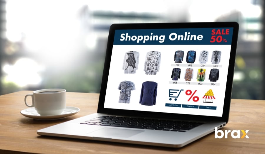
This is where remarketing comes into play. By giving these potential customers a better deal or by adding urgency to the offer, you can prompt action and encourage them to complete the purchase.
What's the secret to successfully luring them back in? It's a friendly nudge in the right direction that just might seal the deal.
Simply send them to the product page with a killer offer that they simply can't resist. It could be a better price deal, a bundle offer, discounted price, free shipping, or even just a countdown until stocks run out!
Even without the better deals and offers though, when it comes to remarketing, it's like reminding your customers about something they forgot. You should make it as easy as possible for them to convert since they know it already.
So for remarketing campaigns, send your customers to the product page.
Scenario #3: When the Audience Has Heard About Your Product Before But Does Not Know It Well
You're probably familiar with the scenario where your audience has heard of your product before but doesn't quite know it well enough to make the leap and become a customer themselves.
How do you convert those individuals into loyal customers?
One effective approach is to send them to a storytelling landing page, where you can paint a vivid picture of your product's benefits and help them visualize themselves as satisfied customers. People are more likely to convert into customers when they can see how your product could benefit their lives.
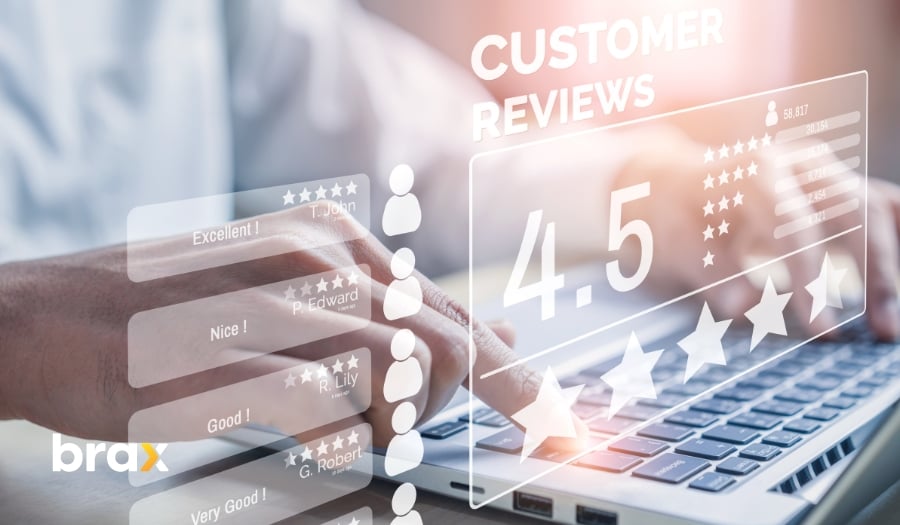
Alternatively, sharing customer reviews and testimonials can inspire trust and confidence. By highlighting real-life examples of how your product has made a difference in the lives of others, you can help potential customers better understand not only what your product does, but why it matters.
Note: For extra reading on how this marketing strategy helps, check our article on the topic of social proof: How to Use Social Influence to Steer Your Customers Towards a Purchase.
It's an adaptable approach that can work for a wide range of products and services — all you need to do is give your audience a reason to care.
So to enhance your customers' trust in a product, send them to a landing page.
Scenario #4: When the Audience Knows About Your Company But Not This Product
In this scenario, you've got a brand that people recognize, but they don't yet know about that one awesome product you just launched. It's like being the less famous sibling who's just as cool but doesn't get the same level of hype.
What do you do?
Bring your sibling to the party, of course!
This means you should create an equally bad-ass product page and then send your customers there. They're already familiar with your brand and company, which means your website is nothing new to them.
Also, sending your customers to a product page allows you to transfer or share the trust you've built with your audience with this new product.
For product introduction with established customer loyalty, send your audience to the product page.
Scenario #5: When You Want to Get a Lead Instead of an Outright Sale
You know what they say — slow and steady wins the race. And in the world of business, that couldn't be more true.
You're a savvy marketer, and you know that building trust and engagement is paramount to the success of your business. Sometimes, you just want to focus on building relationships rather than just making an outright sale.
That's where getting a lead comes in handy.
But how do you convince someone to give you their contact information?
You sweeten the pot by throwing in something that adds value: think a free eBook, a coupon for their next purchase upon joining your mailing list, or even a funny and shareable meme.
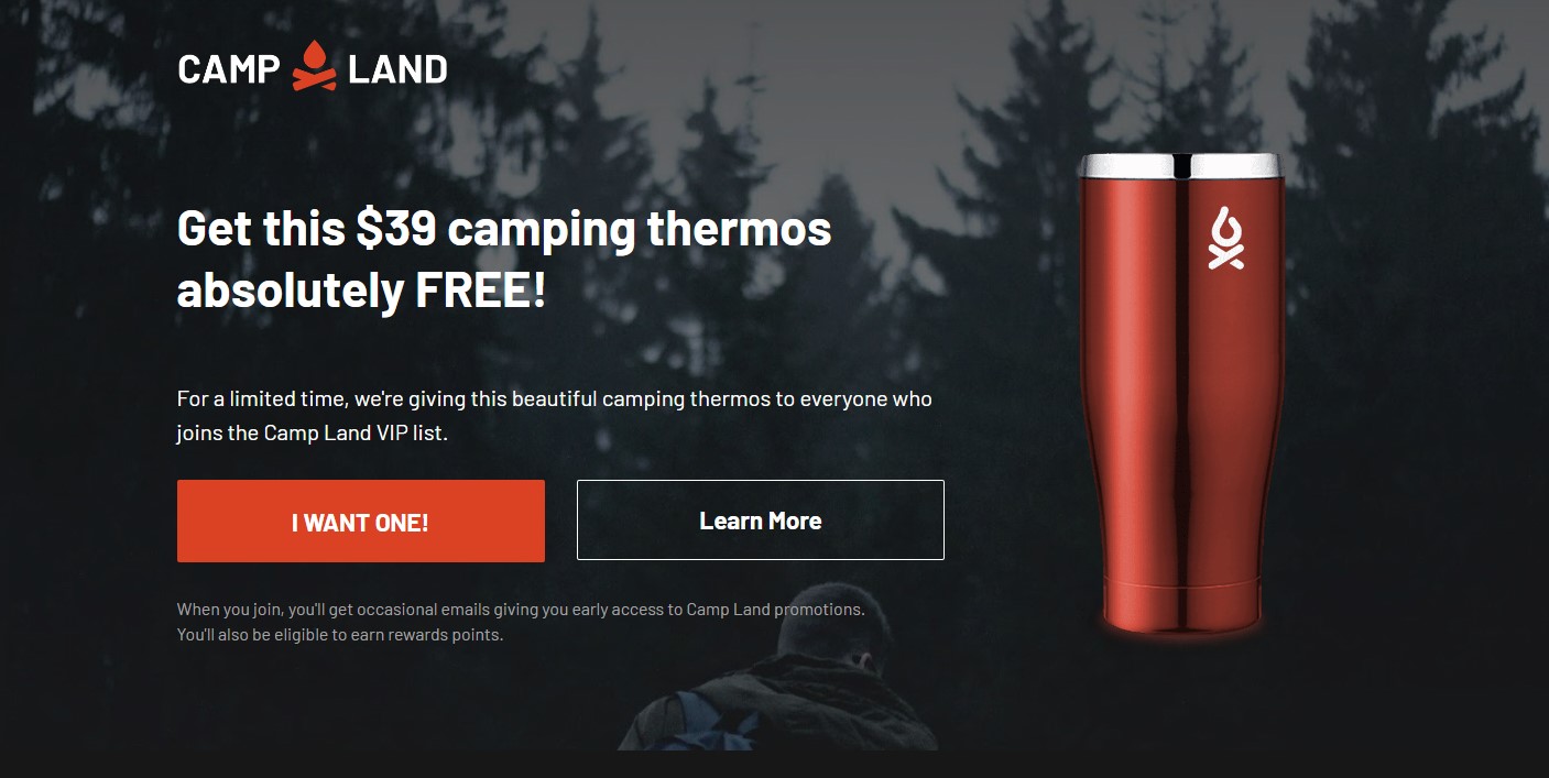
Trust me, it's like getting to know someone over coffee before popping the question. Next thing you know, your prospect is engaging with you on all channels, sharing your content, and hitting your site time and time again.
All it took was a thoughtful approach to nurture a lead into your sales funnel. So take this as your sign to slow down, woo your potential customers, and watch the leads roll in.
And after a few weeks or months of warming them up, you can start sending them to your product page — you can expect high purchase rates this way.
To generate leads, landing pages are the way to go.
Scenario #6: When You Want the Customer to Buy This Particular Product Only and Not Others In Your Product Line
Imagine yourself in a store, wandering aimlessly down aisles of products that you don't need. And then, like a beacon of hope, you spot the one item that you came for.
You run to grab it, but wait — what's this?
A whole section of similar products, tempting you to stray from your mission and spend more money. Annoying, right? Well, that's exactly how your customers feel when you bombard them with a plethora of choices on your website.
And you know what happens when customers are faced with tons of options? They get analysis paralysis. Instead of proceeding with a purchase, they end up buying nothing because they feel overwhelmed.
Read my article on The Paradox of Choice to understand why this happens and how it's counterproductive for most businesses.
So why not make it easy for them?
Create a landing page or a sales page featuring one carefully curated product that you know they'll love.
Give them a chance to buy it without being distracted by a sea of other options. It's like taking them on a first-class flight to their destination, with no pesky layovers to ruin the experience.
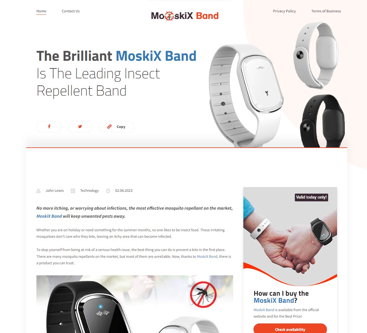
Sure, it might mean you're not showcasing the full extent of your product line, but if it increases the chances of converting a curious browser to a loyal customer, who cares?
In fact, studies show that having more than one offer on a page can reduce sales by a whopping 266% — that is not something you should look down on!
So take a leaf out of the minimalist book and simplify the buying process for your customers. Trust us — they'll thank you for it.
To increase sales of a particular product only, send your customers to a landing page.
So, what have we learned when it comes to landing page vs product page?
Number one is that choosing which is better between landing page vs product page is not a one-size-fits-all matter. You need to consider the various scenarios, not to mention evaluate the specific goals you want to achieve — and that makes all the difference.
But if, after all the sample scenarios above and you still can't decide where to send your customers after clicking on any kind of ad (whether social media ad, native ad, or something else), then your best option is to create an A/B test campaign to determine which performs better.
What is an A/B Test Campaign, and how do you do it? Here's a quick guide for you: A/B Testing for Native Ads: Finding the Perfect Ad.
In the meantime, if you want to measure the performance of your landing pages or product pages when sending audiences through native ads, why not try Brax? Book a free Brax demo and see how you can bridge the marketing gap and improve your business.
